Platform Tips #21: What Could Be A Better Alternative To Backstage
I want to share my thoughts on what could be a better open-source alternative to Backstage for platform engineering teams based on 3 pillars
Hey Folks 👋,
I'm Romaric, CEO of Qovery, and this is my 21st Platform Tips post.
Last week, we talked about the story behind Backstage and why it’s so complex. This week, I want to share my thoughts on what could be a better open-source alternative to Backstage for platform engineering teams based on 3 pillars:
Ease of use (no code)
Low maintenance (it just works)
Intuitive for developers (DevEx)

Backstage's Original Intent
As explained in my last article, Backstage was designed to be a one-stop shop for developers — a place to manage services and documentation, bootstrap new projects, and integrate best practices effortlessly. The core idea was simplicity: enabling developers to perform necessary but peripheral tasks without navigating multiple systems or learning new tools. Despite its ambitious goals, the increasing complexity of Backstage has sometimes alienated the very users it was meant to empower.
Proposing a New Approach
With the community's insight, I envision an alternative that rests on three main pillars:
Ease of Use
The alternative should be straightforward, allowing platform engineering teams to get it up and running in under five minutes. The key here is not just easy configuration but also usability that doesn't require extensive documentation or learning. The goal is for any team member, irrespective of their technical depth in specific areas, to utilize the portal effectively without prior training.
Example: It should not be more complex than that to get started and even run in production:
$ docker run oss-portal-backend --config config.yaml --catalog catalog.yaml
OSS portal backend is started and listen on port 1234

$ docker run oss-portal-frontend --server localhost:1234
OSS portal frontend is started and listen on port 80
Low Maintenance
High maintenance is a common issue with Backstage, often necessitating dedicated roles just for upkeep. Our approach should minimize this need by simplifying the portal's scope and design. An ideal feature would be to leverage existing scripts and tools that platform engineers already use, thus avoiding the need for custom integrations written in specific programming languages or frameworks.
Example: Do you already have a Terraform script that you want to give your developers access to with some fields that they would have to complete? No problem… The catalog.yaml could look like this:
catalog:
  - name: Create Dev Cluster
    description: Create your Kubernetes cluster for development
    icon: assets/kubernetes.png
    fields:
      - title: name
        description: Your cluster name
        placeholder: dev-{{random()}}
        type: string
        default: dev-{{random()}}
        required: true
        autocomplete-fetcher: ./your-script.py (optional)
      - title: description
        description: Your cluster description
        placeholder: type your description
        type: string
        required: false
      - title: ttl
        description: The Time-To-Live in hours for this cluster
        type: number
        constraints:
         - min: 1
           max: 48
        default: 12
        required: true
    validate:
      - command:
         - bash
         - validation-script-1.sh
      - command:
         - bash
         - validation-script-2.sh
    post_validate:
      - command:
         - terraform
         - create-cluster.tf
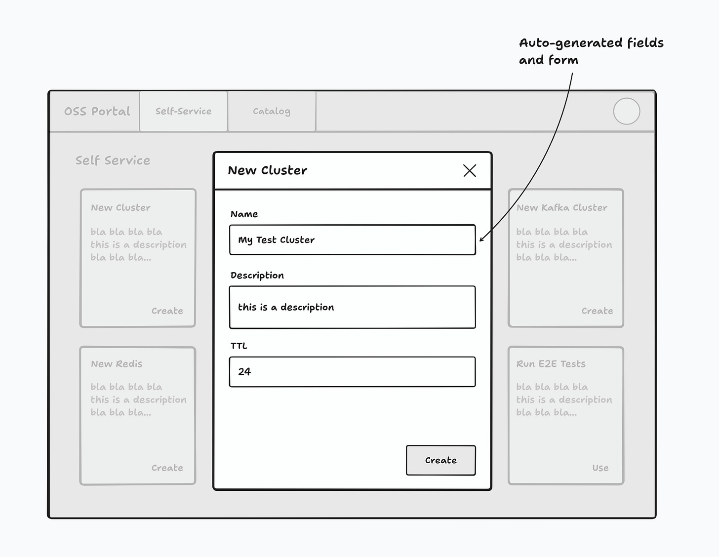
The UI would then be auto-generated. Your developers can safely use the UI to create their dev cluster via your create-cluster.tf Terraform script. Their inputs will then be checked with the scripts you provided and passed to your Terraform script.
Intuitive for Developers
The portal should embody the "Keep It Simple, Stupid" (KISS) principle. It should avoid unnecessary complexity and instead focus on a user-friendly interface that developers find intuitive. The design should enable developers to quickly self-serve for the tasks they need—nothing more, nothing less. Ideally, the UI would dynamically adapt based on backend configurations, ensuring a straightforward and clear experience for the user.
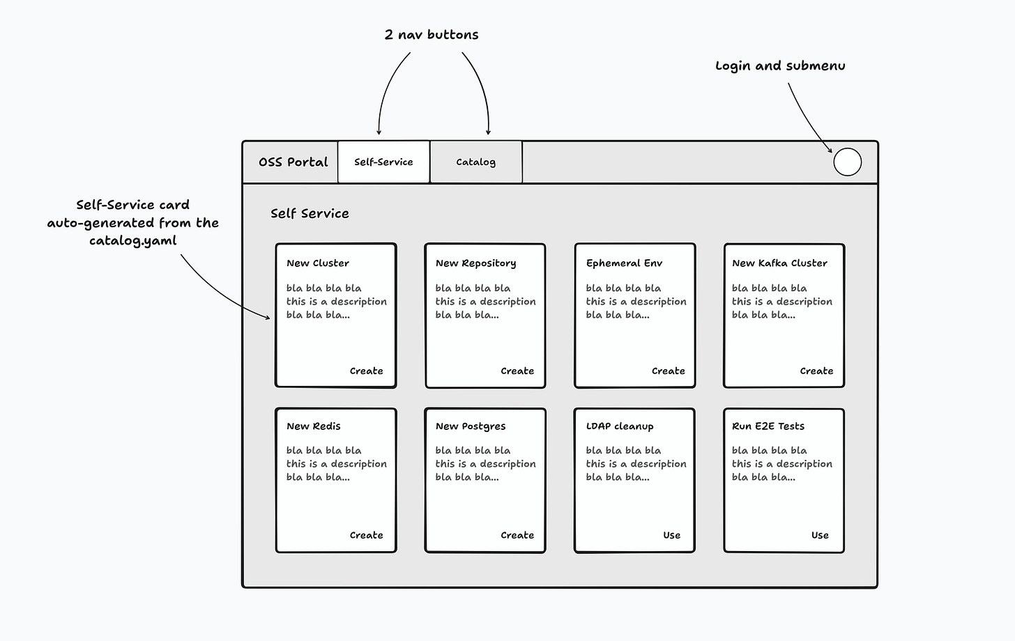
Example: this could be a simple self-service interface for the developers.
The UI is auto-generated and based on the configuration YAML provided by the platform engineering team. When the developer clicks on a self-service card (E.g., “New Cluster”), the auto-generated fields and form appear.
Share Your Feedback
This proposal is just a starting point. I invite feedback, suggestions, and ideas from all of you in the platform engineering community. What features are essential for your daily operations? What frustrations have you encountered with existing tools? Your input is invaluable as we aim to design a tool that truly meets your needs without adding unnecessary complexity.
Share your feedback in comments or contact me directly
Conclusion
As we consider the future of open-source developer portals, our focus should be on stripping back the unnecessary and honing in on what truly matters: creating tools that serve their purpose without becoming burdens themselves. Let's build something that brings us back to the basics, prioritizing ease of use, low maintenance, and intuitive design.
—
Let's revolutionize Platform Engineering by putting developers first. Subscribe now to join me on this exciting journey!


